Bourdieu and dataviz
[Please forgive (or correct) my English skills]
Bourdieu did many experiments with diagrams, what we tend to call “dataviz” today. Techniques of data visualization are not usual in contemporary sociology (according to Kieran Healy and James Moody’s paper) and they were not that usual forty years ago when Bourdieu wrote and drew.
Let’s begin with an image :
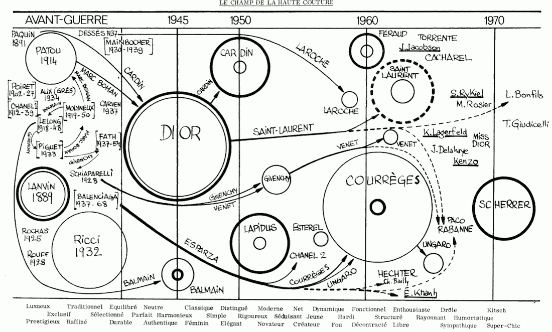
This image was published in an article about fashion and “haute couture” (le couturier et sa griffe, written with Yvette Delsaut)
And it dates back to a time when graphics had to be drawn by hands. The journal created by Bourdieu and his team, “Actes de la recherche en sciences sociales“, used the services of a comics creator who is also an academic, Pierre Christin… but I don’t know if Christin drew this particular graph. The source used by Bourdieu is from a trade magazine : “17 couturiers, leurs structures économiques”, Dépèche-Mode, n°683, mars 1974, and it is a great and complex “dataviz”. One could add some embellishments with d3.js but the structure is well-thought.
How to read the image :
- – Haute Couture firms are placed according to their foundation date
- – the thin-line circle is proportionnal to the number of employees
- – the bold-line circle is proportionnal to the sales [revenue, sales turnover] : sales usually grow with the age of the firm
- – the arrows represent the moves of specific individuals from one “haute couture house” toward another (you can see Yves Saint-Laurent leaving Dior to create Saint-Laurent) : « les nouveaux entrants sont pour la plupart des tranfuges des maisons établies » : “the “new” couturiers are very often turncoats [defectors?] from established Houses”
- – the words at the bottom are words associated in 1974 with the Haute couture firms founded between 1880 and 1970 : Lanvin is “luxurious” and “exclusive”… Lapidus is “moderne” and rigorous”… Scherrer is “kitsh” and “ultra-chic”
It seems that this article “le couturier et sa griffe” (the fashion designer and his signature) has not yet been translated in English.
Let’s now give some background on this image :
- Bourdieu discusses on several occasions the uses of graphics (maps, plans, calendars, genealogical trees…) in his books. It is in “Le sens pratique” (1980), in which Bourdieu discusses his relationships with structural anthropology, that you will find the most thorough analysis of the use of diagrams :
[My translation :] One should not see more than a theoretical artefact in the schema that put together as a sharper and synoptical form the information gathered by a recollection work(…)
[in French] p.335 Il faut se garder de voir autre chose qu’un artefact theorique dans le schéma qui rassemble sous une forme resserrée et synoptique l’information accumulée par un travail de recollection (…)p.335 [schemas and explanations] are useful in two ways. First they offer an economical way to give the reader an information reduced to the relevant outlines [relevant features] and ordered according to an ordering principle both familiar and immediately visible. Second they enable us to show some of the difficulties that are created by the effort to gather and linearise the available informations (…)
[schéma et explication] sont utiles à deux titres différents: premièrement ils offrent un moyen économique de donner au lecteur une information réduite aux traits pertinents et ordonné selon un principe d’ordre à la fois familier et immédiatement visible; deuxièmement, ils permettent de faire voir certaine des difficultés que fait surgir l’effort pour cumuler et linéariser les informations disponibles (…)
Bourdieu wanted his diagrams to be read quite easily, but he did not want his diagrams to be only simple, they ought also be able to show that the translation from the observed reality to the graphical space is difficult. To show the work involved in creating these diagrams. They need to show many data points.
- The article “Le couturier et sa griffe” was published in the very first issue of “Actes de la recherche en sciences sociales“. An award-wining comics artist and illustrator, Jean-Claude Mézières, played a role in the graphical layout of this journal (which did not look like an academic journal). [to be clear : Mezières worked with Christin, who was married to the editorial staff of Actes, Rosine Christin : small world]
Luc Boltanski (who was at the time a follower of Bourdieu) wrote recently about the creation of Actes de la recherche en sciences sociales. In this text we understand that diagrams were not only “post-structural” devices. They were also “post-comics” devices.
[Rendre la réalité inacceptable, Paris, Demopolis, 2008]
p.19 I collected fanzines bought in specialized bookstores. What we called fanzines at the time were small magazines by comics “fans”, often published by amateurs, without many funds (…) One of these fanzines seemed especially effective [beautiful ? successful?] : it was called Schtroumpfs (the title was an hommage to the little blue Smurfs [called Schtroumpf, in French]). One day, when I was discussing the
thorny “journal-that-we-don’t-have” question with the boss, I pulled one issue of Schtroumpf from my bag and I said to him “We will make a sociological fanzine”…je collectionnais les fanzines achetés dans les librairies spécialisées. Ce que l’on appelait alors des fanzines étaient des petites revues de “fan” de BD, souvent publiées par des amateurs, avec très peu de moyens (…) L’un de ces fanzines me semblait particulièrement réussi: il s’appelait Schtroumpf (en hommage aux petits lutins du même nom). Un beau jour, au cours d’une conversation avec le patron sur cette fameuse question de la revue dont nous manquions, je sortis un exemplaire de Schtroumpf de mon sac et je lui dis: “on va faire un fanzine de sociologie”…
- One can find a few texts that reflects on Bourdieu’s use of diagrams, photographs, graphs and typographic variations. For example in Michel Gollac’s text : La rigueur et la rigolade (in : Rencontres avec Pierre Bourdieu, sous la direction de Gérard Mauger, Éditions du Croquant, 2005). The title translates as “Rigor and fun”, and this text reflects on Bourdieu’s oral advice that sociology should be “fun”. [I would say that his idea of “fun” was a peculiar scholastic fun. Bourdieu was not very well known for being funny]. Gollac’s idea in this text is that Bourdieu’s diagrams (which were not always based on hard statistical evidence) were supposed to be a “fun time” during the reading. A fun pause, a “free trip” into social space. But these graphs required a “strenuous effort” to be drawn… Rigor and fun…
A central part of his text is :
« Whether handmade diagrams or true correspondance analysis graphs, what’s essential is that they offer a novel possibility (unthinkable with tables or regression analysis results) : to wander freely in a social space. This virtual trip is a fun time, in the strongest sense of the word : offering in a single gaze the whole possible lifestyles (which is not possible with a variable-by-variable classical analysis) . it [the trip] condenses in a short amount of time the pleasure to “live all the lives”, to use one ofBourdieu’s expression.
This condensation of the whole possible shows [makes it to appear, in French] that each practice is situated and takes its meaning only in relation to the other practices, and this is showed through a
conscious and laborious effort, but also through the pleasure of the sensible evidence and visual esthetics. »« Qu’il s’agisse de diagrammes faits à la main ou de véritables graphiques d’analyses de correspondances, l’essentiel est qu’ils offrent une possibilité inédite, impensable à l’aide de tableaux ou de résultats de régressions : se promener librement dans un espace social. Cette promenade virtuelle est un moment fun, au sens le plus fort : offrant, en un seul regard, l’ensemble des styles de vie possibles (ce que ne permet nullement un traitement classique, variable par variable), elle concentre en un court instant le plaisir de « vivre toutes les vies », pour reprendre l’expression de Bourdieu.
Cette concentration de l’ensemble des possibles fait aussi apparaître, non seulement à travers un effort conscient et pénible, donc à peu près impossible à soutenir tout au long d’une recherche, mais aussi à
travers le plaisir de l’évidence sensible et de l’esthétique visuelle, que chaque pratique se situe et ne prend sens que par rapport aux autres. » - From all these elements, it follows that diagrams are not simple images of statistical relations between variables. The relationship between statistics and images is far from being univocal :

In the French edition of La Distinction, the “Graphique 5 / Graphique 6” “Espace des positions sociales / Espace des styles de vie” is famous. Bourdieu writes in a note that “it is not a correspondance analysis graph”, but a summary of many partial graphs that takes the form of a correspondance analysis graph. In short he says : I don’t have the data to back this graph, but I have many smaller datasets that hints at this graph… so… let’s do it.
There are other “fake” graphs : « L’espace des consommations alimentaires » (graphique 9), « L’espace politique » (graphique 21) : « This diagram is a theoretical outline [schéma] that was constructed on the basis of a thorough reading of available statistics (and of various correspondance analyses) » [French text : Ce diagramme est un schéma théorique qui a été construit sur la base d’une lecture approfondie des statistiques disponibles (et de différentes analyses des correspondances).]Some see Bourdieu as a “faussaire statistique génial” : a brilliant statistical counterfeiter. But let’s be charitable and let’s speak of “a genial compositor” (creator of composite graphs).


2 commentaires
Un commentaire par Somewhere else, part 119 | Freakonometrics (14/03/2014 à 5:12)
[…] “Data Visualization in Sociology” http://kieranhealy.org/files/papers … via @coulmont‘s “Bourdieu and dataviz” http://coulmont.com/blog/2014/03/12/b… […]
Un commentaire par The transformative powers and the politics of data visualisation: a case with personal network data | Data Big and Small (24/04/2014 à 9:57)
[…] liData visualisation is still relatively uncommon in the social sciences, and is not normally expected to be part of the standard work of a scholar (contrary, some would say, to what happens in the sciences, where visualisation is sometimes necessary to figure out the properties of objects whose existence is proven, but which cannot be seen). Yet data visualisation has an extraordinary history of accomplishments even in the social realm, as cleverly documented in a forthcoming article by James Moody and Kieran Healy; and classics such as Pierre Bourdieu valued it and attempted to use it in at least some of their work, as Baptiste Coulmont interestingly reported in a blog post. […]